Sierra Club Service — Giving something back
The Sierra Club Service Subcommittee organizes backcountry volunteer trips across the U.S., bringing together people who care deeply about preserving and protecting public lands. From clearing trails to restoring habitats, the work is hands-on, humbling, and often under-recognized—much like the groups we typically partner with: the NFS, NPS, and BLM.
But beyond the work itself, what makes these trips special is the camaraderie they build: a shared commitment to showing up, giving back, and leaving things better than we found them. This rebrand was a small contribution to that larger effort—an attempt to reflect the group’s spirit more clearly, welcome new members, and create an identity volunteers could be proud to wear on trail and off.
DISCIPLINES
Logo Design
Brand Identity
User Research
Pro Bono
TOOLS
Adobe Illustrator
Adobe InDesign
Adobe Photoshop
Background & Research
The Service Subcommittee plays a vital role in the Sierra Club’s mission, but its visual identity hadn’t kept up with the passion and purpose of the people behind it. For many members, this was their first time working with a designer, so I wanted the process to feel substantial, collaborative and respectful—something built with the group, not just for it.
I surveyed the Service leaders to understand how they felt about the existing logo, what symbols resonated with them, and what kinds outcomes they’d like to see for this work. While a few had sentimental ties to the old design, the results were clear: 97% supported a refresh. Mountains, trails, and hand tools like shovels and Pulaskis emerged as the icons that best captured who we are and what we do.
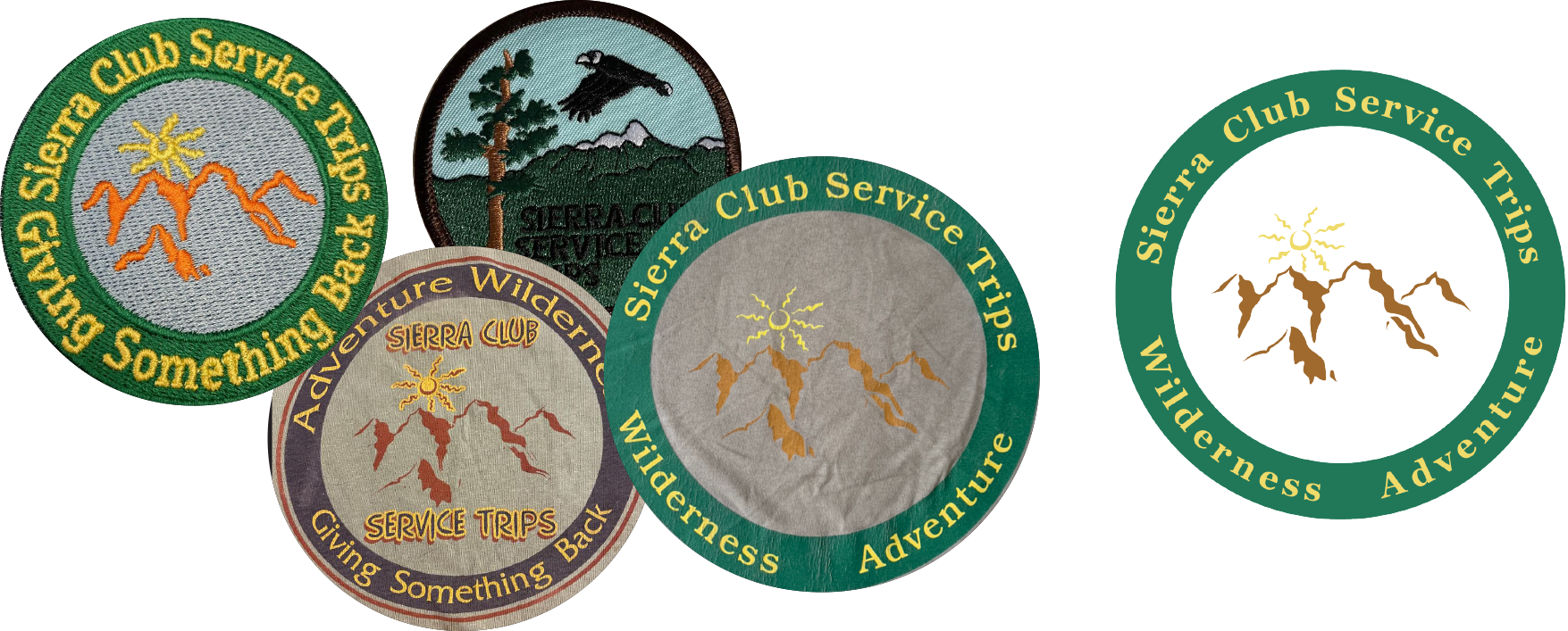
Original Logo(s). On the left are the multiple logos that were in use for the Service Subcommittee. On the right is a vector version I created of the most used version (the original file was lost to time).
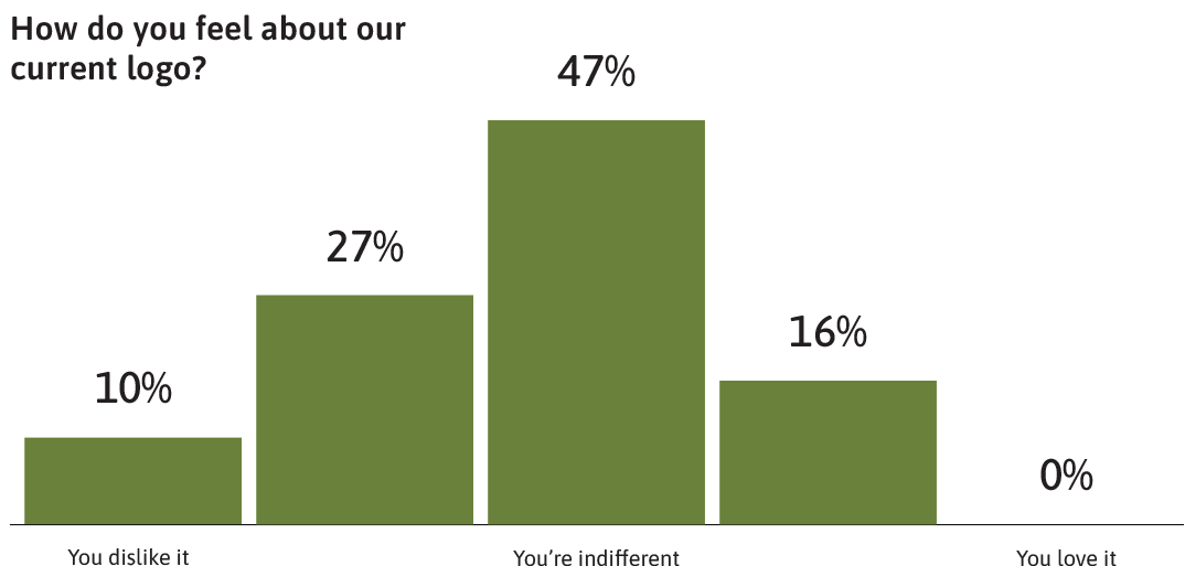
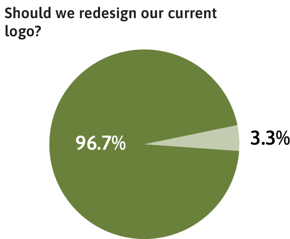
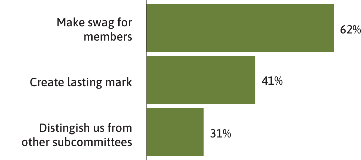
Results. Out of 30 respondents, most felt indifferent about the old logo, but 97% expressed interest in a new one. Branded swag was a clear crowd-pleaser—and so was the desire for a logo with staying power.

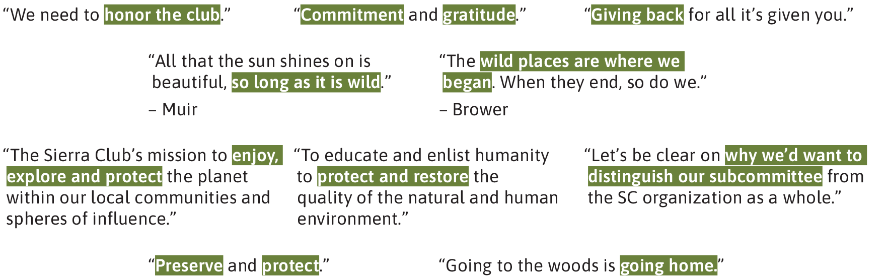
Reflections. Some of the most meaningful insights came from the open-ended responses. These quotes captured how people relate to the Service Subcommittee and what Sierra Club means to them personally. What stood out most was the deep respect for the natural world—and a shared optimism about our community and the work ahead.
Directions
Based on survey results and conversations with subcommittee members, I developed two distinct directions for people to vote on.
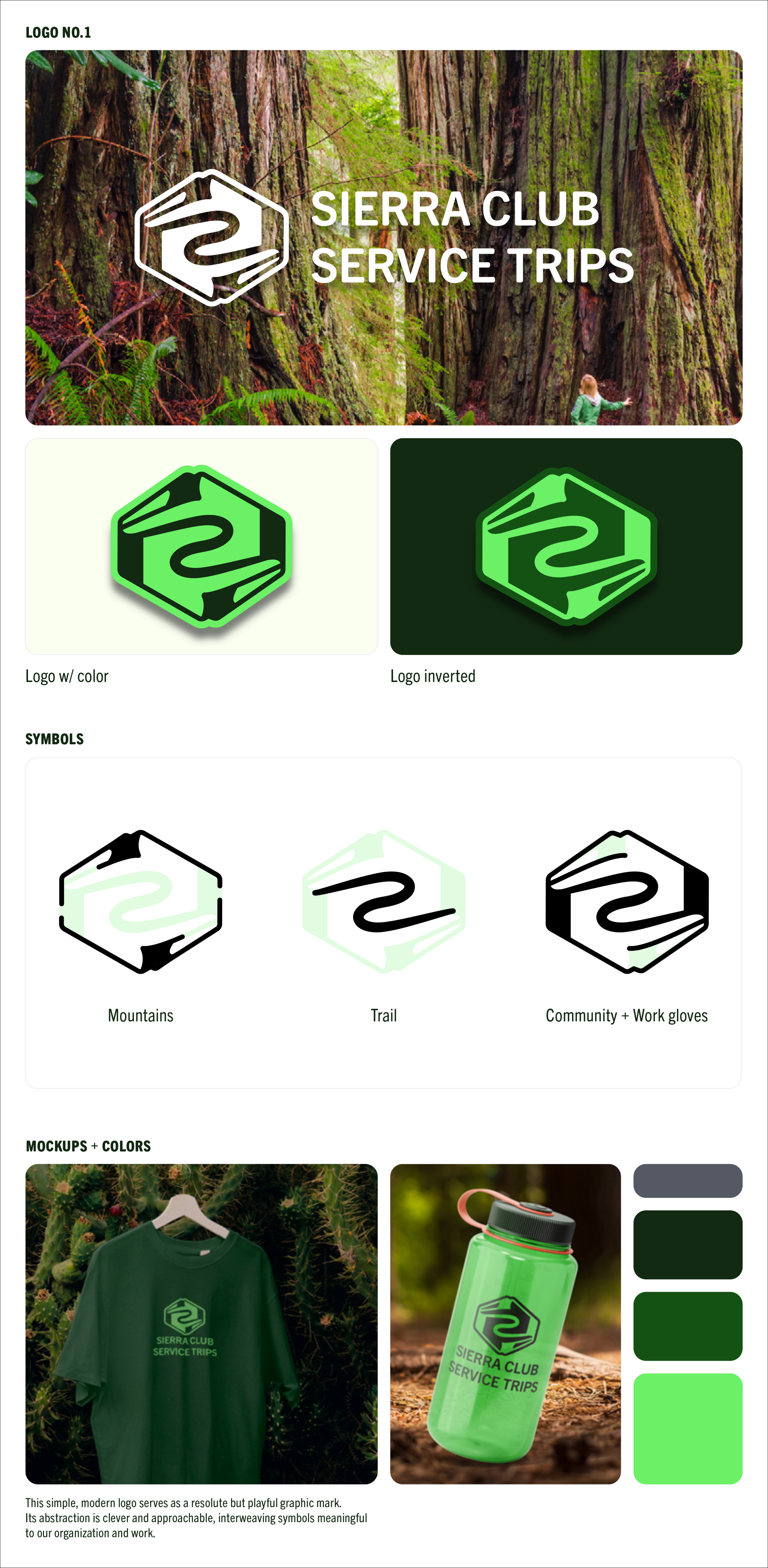
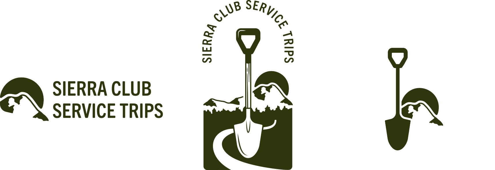
Logo 1 leaned into a more modern, minimal feel. The symbol combined mountains, trails, and work gloves into a clean, graphic mark that felt fresh, approachable, and easy to apply across materials. It represented service work with a forward-looking spirit—something future volunteers could grow with.
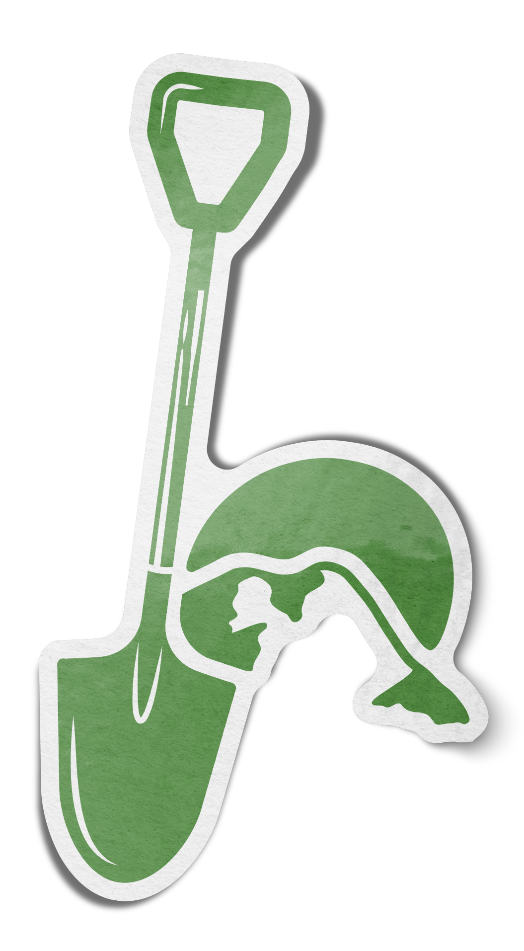
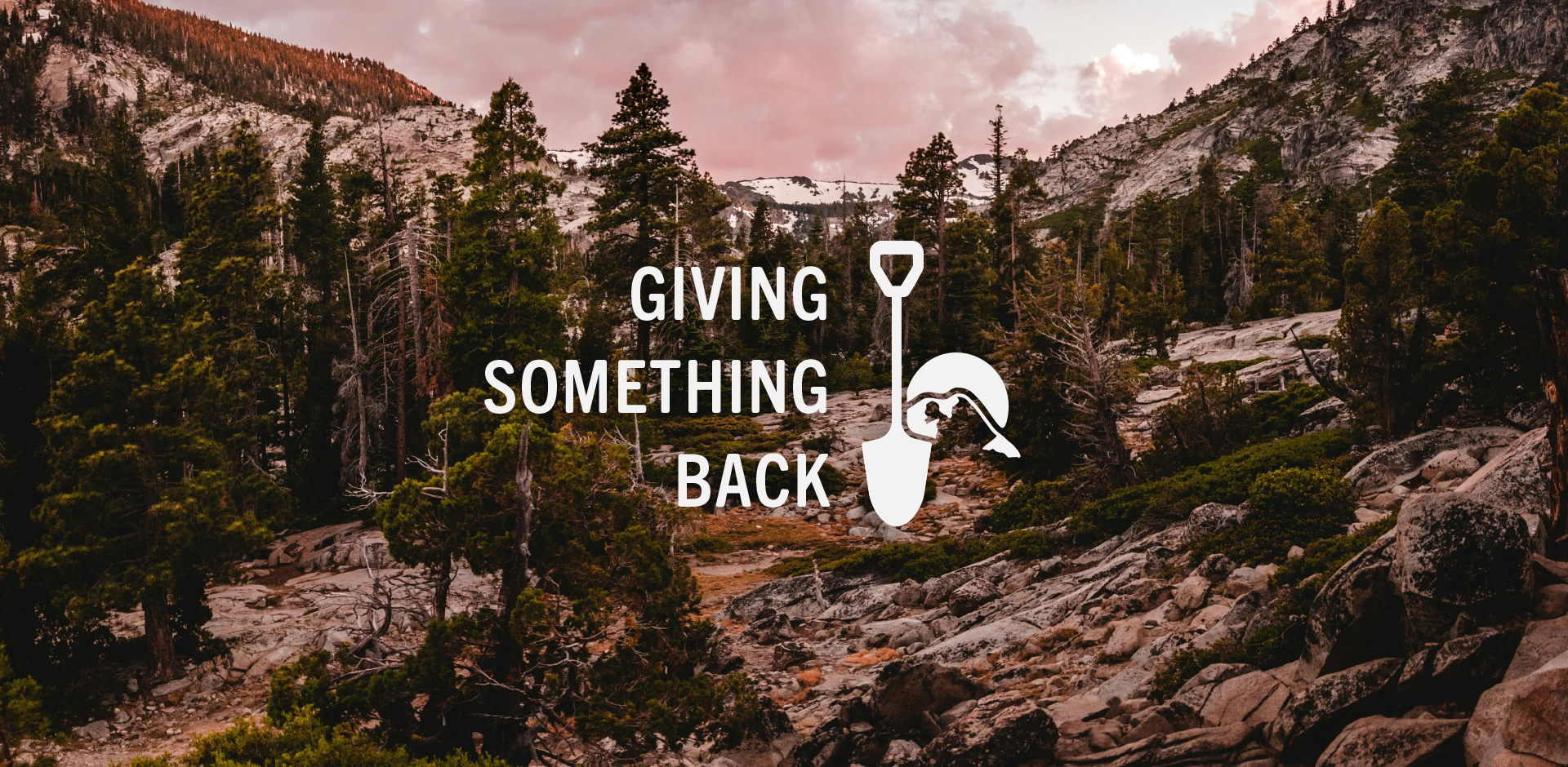
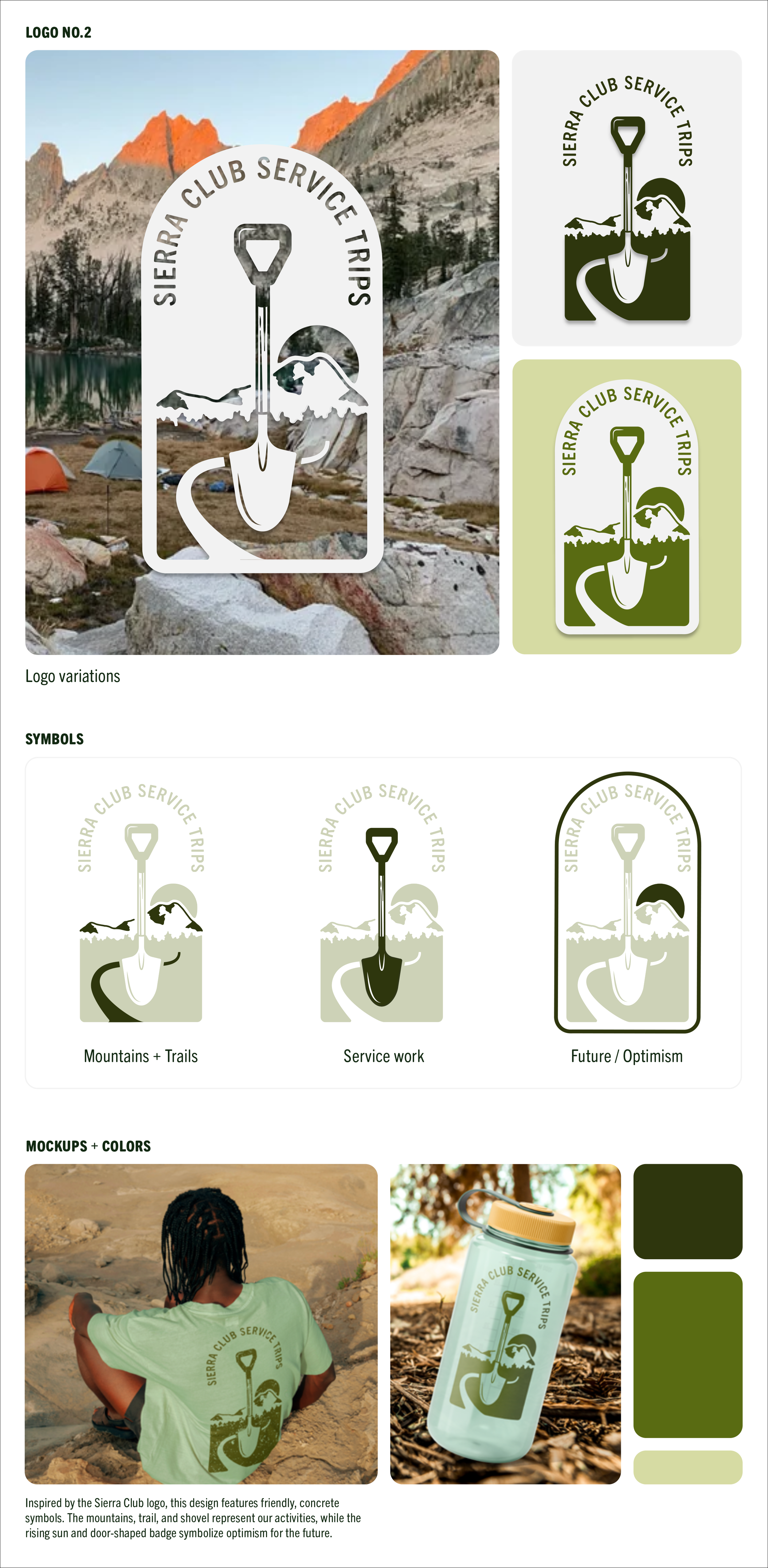
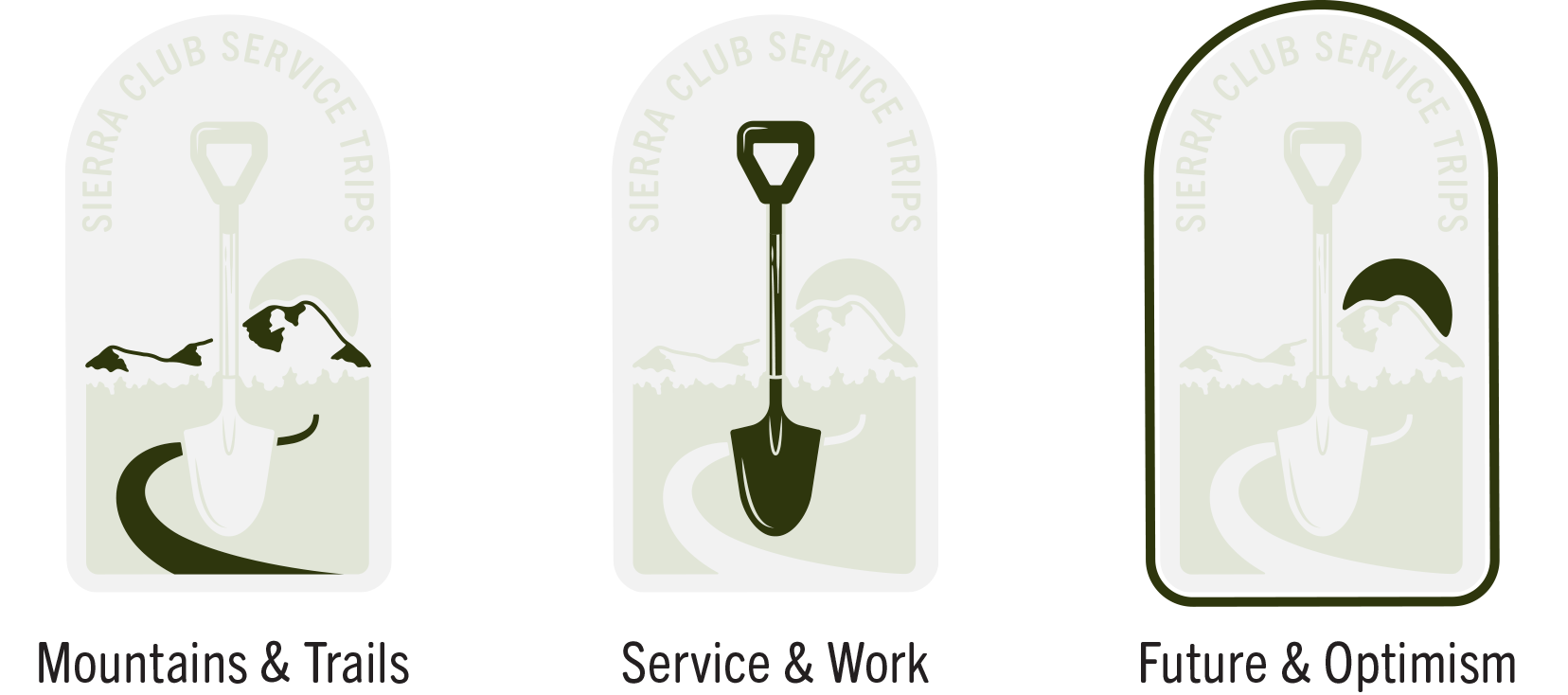
Logo 2 was a more classic, heritage-inspired option. Referencing the original Sierra Club logo, it featured familiar elements like mountains, a winding trail, and a shovel. The rising sun and door-shaped badge evoked optimism and a sense of purpose—an emblem that could stand proudly alongside the broader Sierra Club identity.
After polling there was a clear winner…
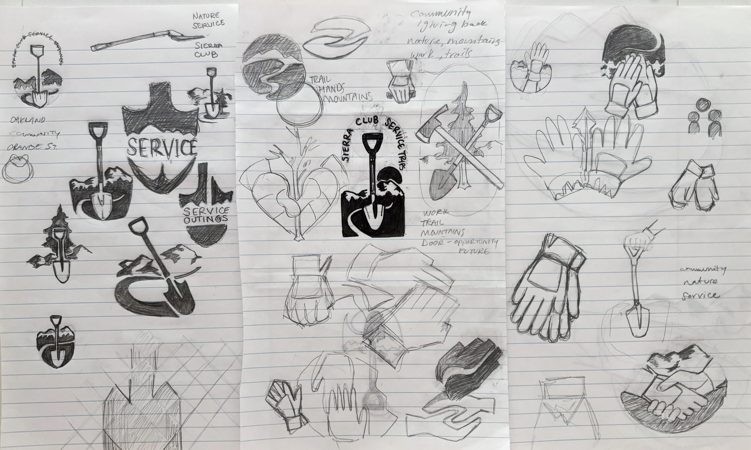
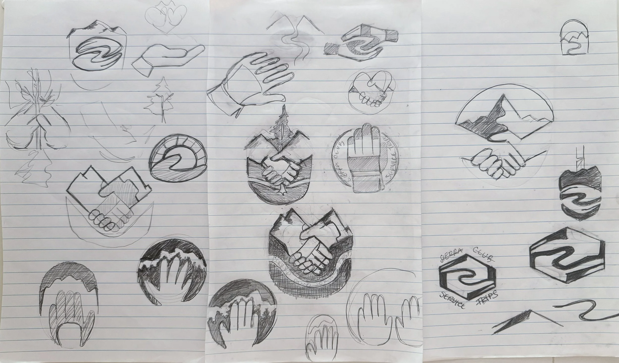
Idle Sketches. Here are some pages from my sketchpad as I was working on this logo. I’ve always wished I had pristine lineart and a clear evolution of ideas, but this is more like how my mind works: messy but productive.
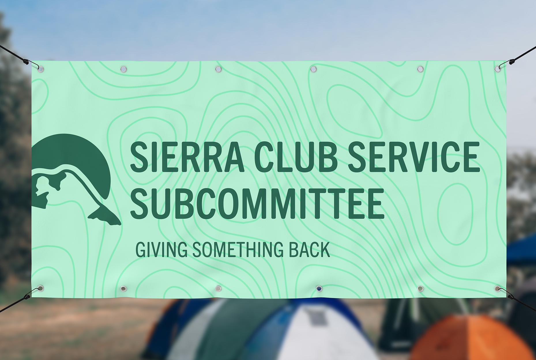
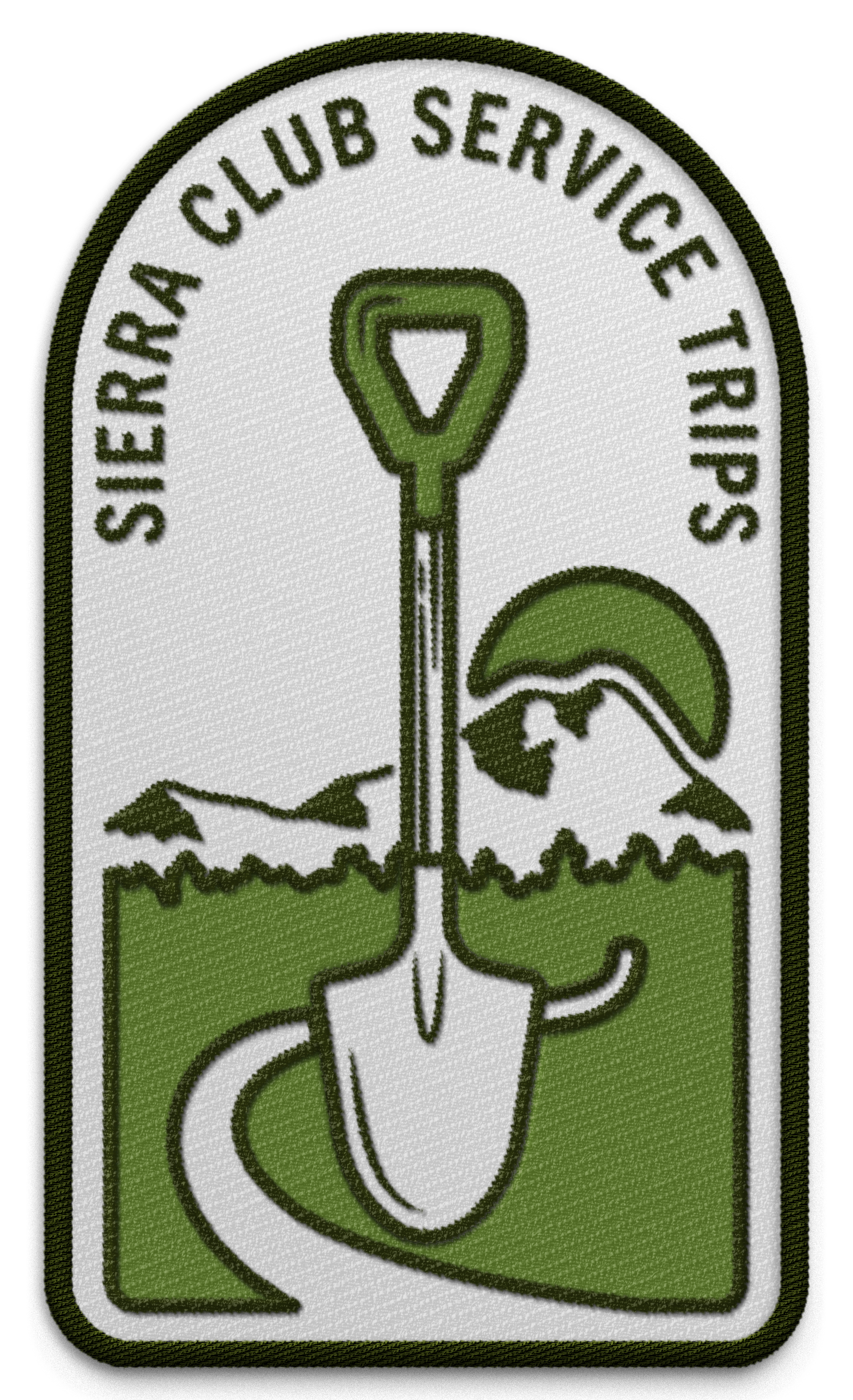
Final Logo
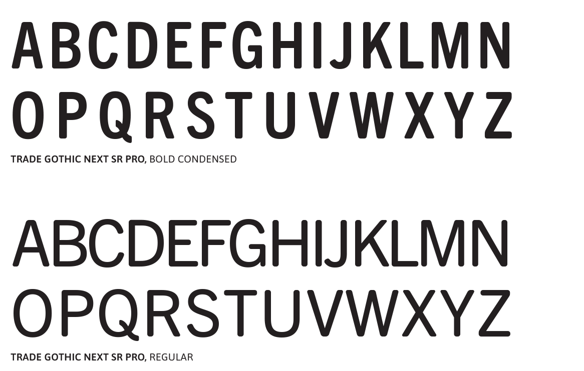
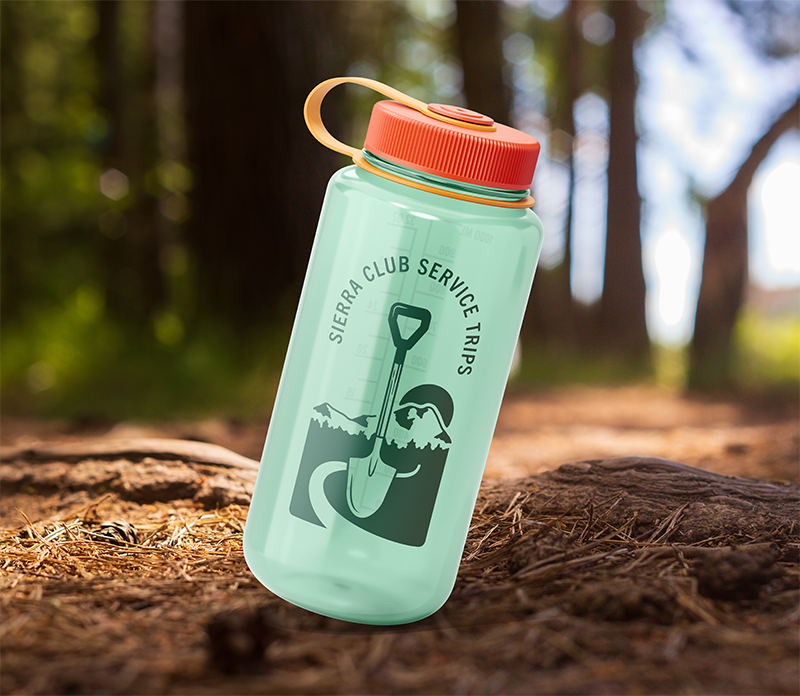
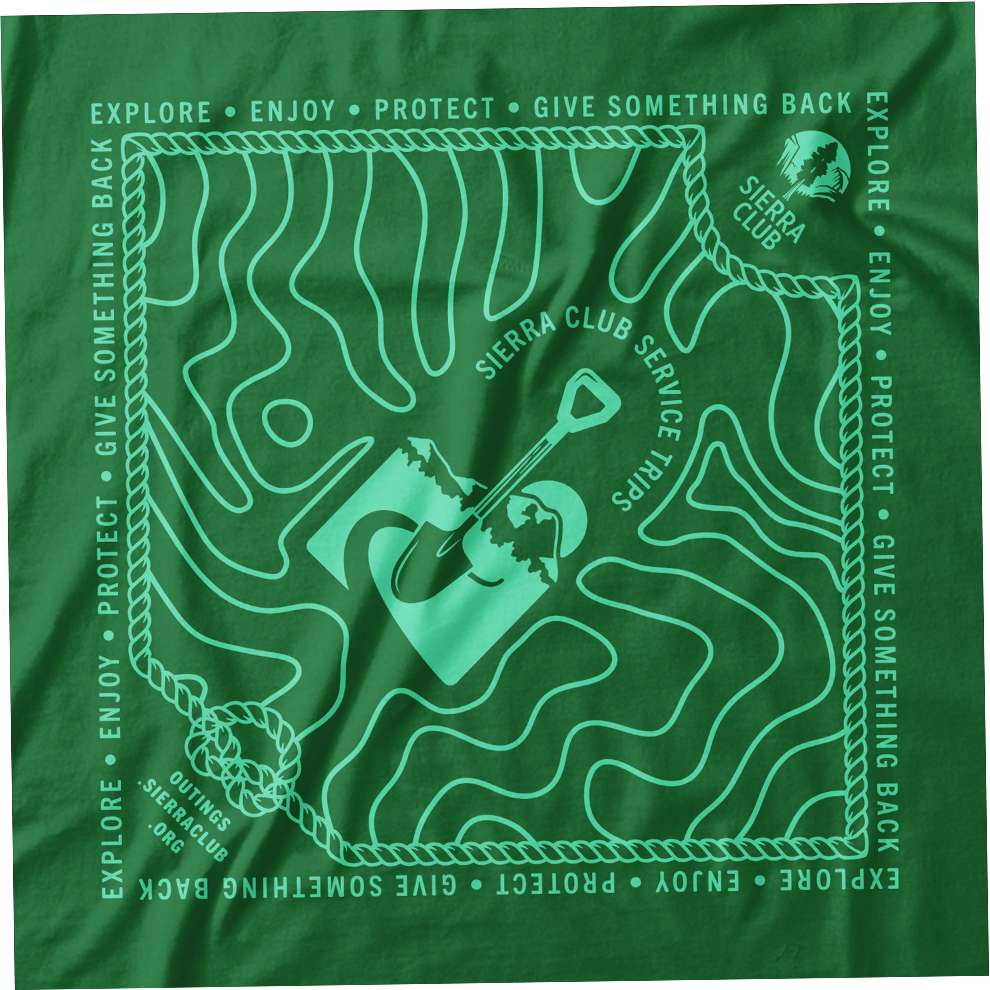
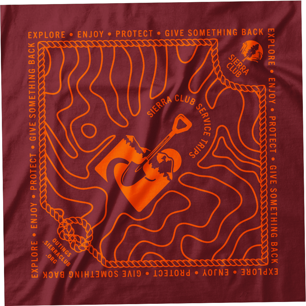
Typeface and Colors. Trade Gothic Next Condensed, with its compact form and rounded edges, echoes the machine-router fonts on National Park signs. The versatile color palette adds a playful touch, allowing for mix-and-match combinations in the logo.
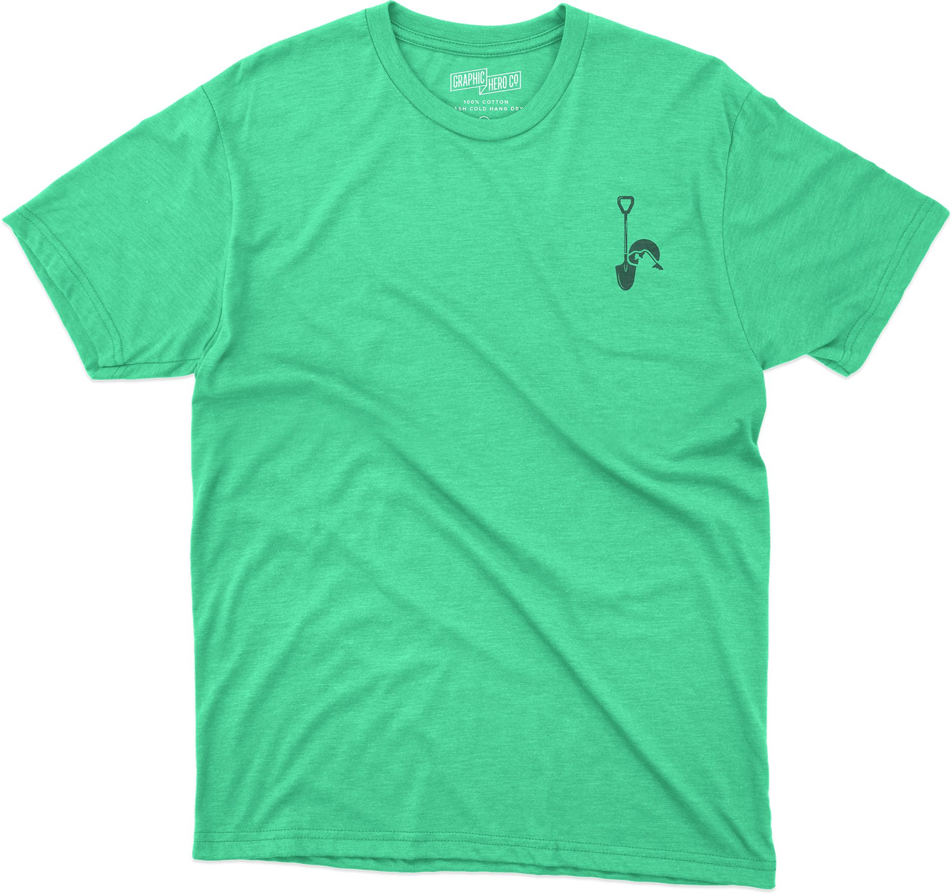
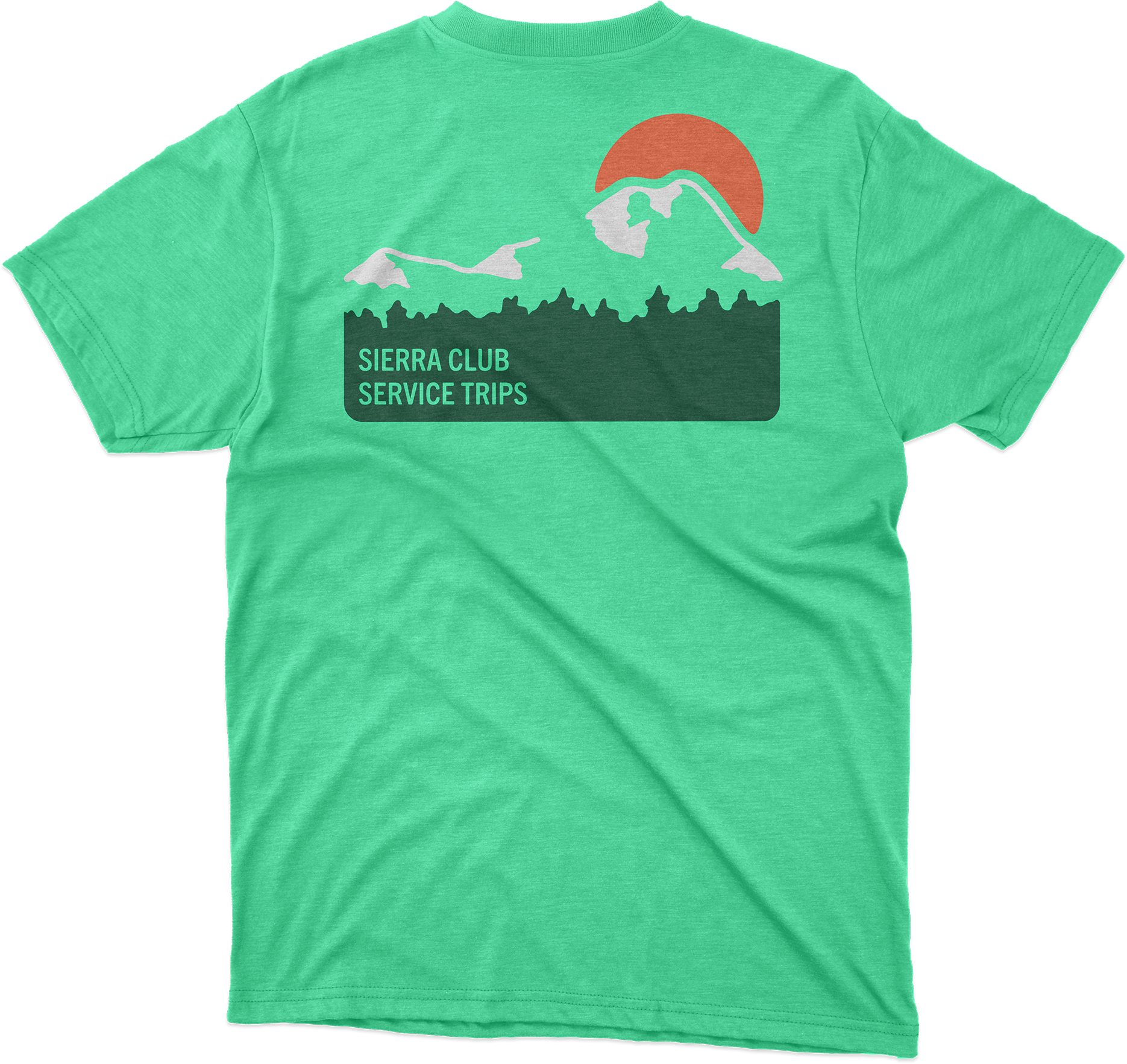
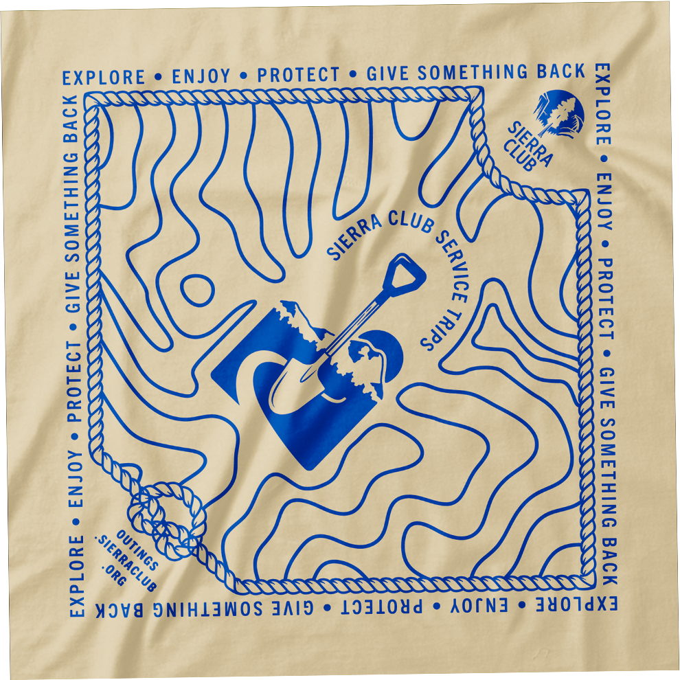
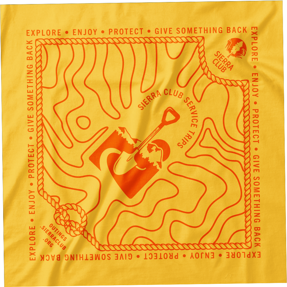
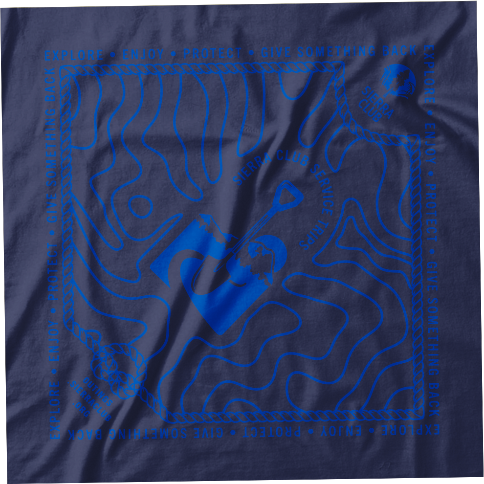
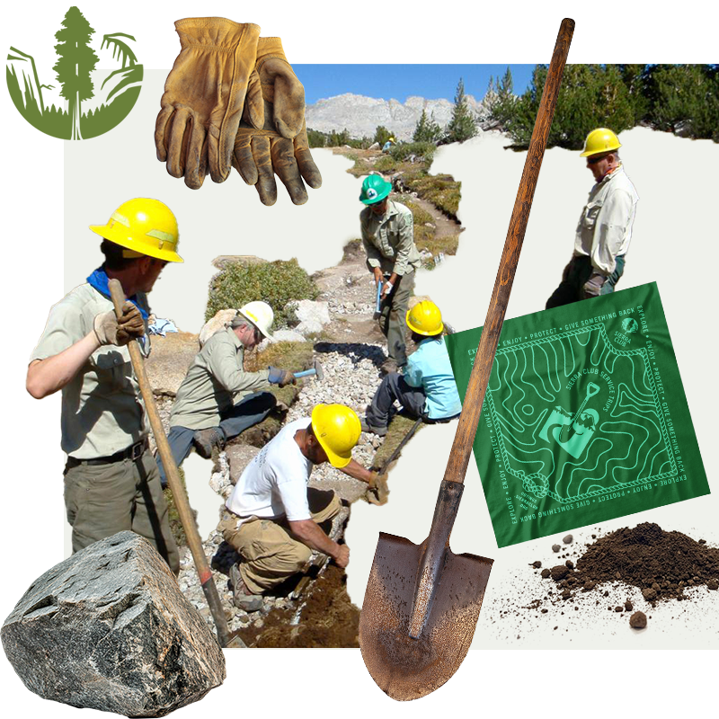
Swag. As promised, I created a set of swag for the team—T-shirts, bandanas, stickers, Nalgenes, and other camp-ready gear we’d actually use (and be proud to wear) on our trips.